My Role
- Creating harmony between User Needs, Business Requirements and Technical Limitations while delivering on-time and within budget.
- Working closely with Business Analysts, Solution Architects and Key Stakeholders to conduct Research, Ideation, Design and Validation for multiple platforms.
- Planning and undertaking the User Research and Usability Studies required to produce related artefacts.
- Identification and maintenance of a diverse User Persona Set.
- Producing Consumer Journey Maps, User Stories, Ecosystem Maps, Competitive Audits, Wireframes and Defining Value Propositions.
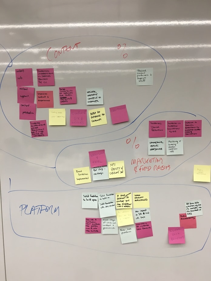
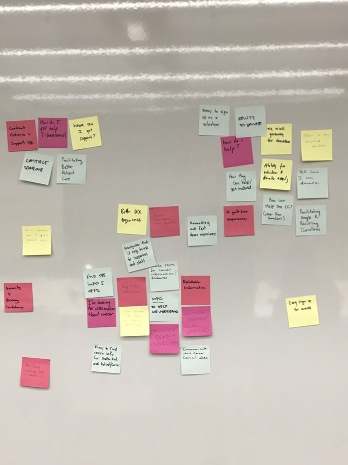
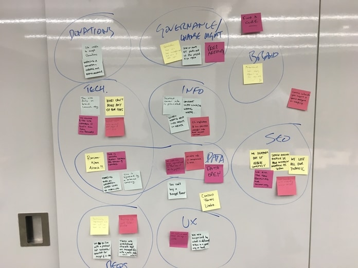
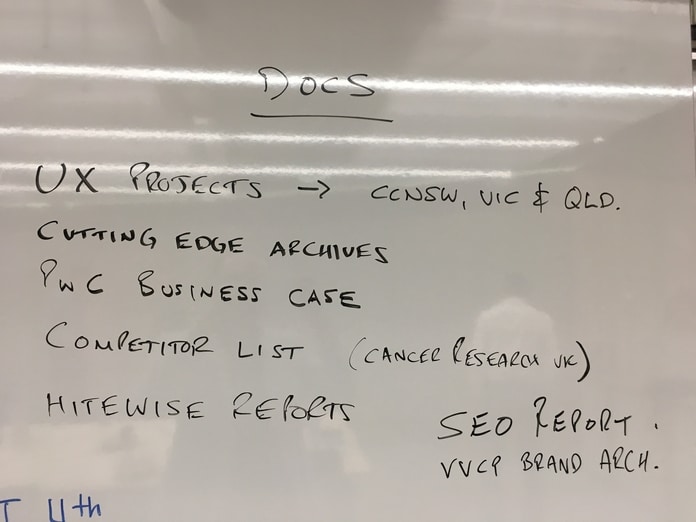
Project Kick-off & Affinity Mapping
The role of the kick-off meeting was to get the conversation started between the agency and Cancer Council stakeholders around several areas involved with the project including:
- High-level needs
- Delivery dates
- Upcoming campaigns
- Platforms
- Governance
- Technology
- Donations
- SEO
- Brand
- UX
Information Architecture
With over 240 existing navigational menu items on the national site to contend with, we had our work cut out for us.
Information Architecture is an often overlooked and underrated field within the realm of User Experience Design. It can however - make or break your product experience.
IA relies upon the interplay of three components to ensure delightful user experiences:
- Ontology
Establishing particular meaning.
- Taxonomy
The way elements are organized or categorized to accomplish specific goals.
- Choreography
Comes together when meaning (ontology) and categorization (taxonomy) interact with each other to create an experience.
Existing IA

Gained Insights
Information Architecture Hypothesis
In conducting our research around navigation menu language we identified 3 linguistic constructs that could be utilised, each with its own set of pros and cons. In assessing the appropriateness of these 3 types of navigation we arrived at the following hypothesis to test and iterate to achieve a best in class solution.
Therefore, Bilue hypothesize the most effective IA would engage Object Oriented Language and grouping for the primary navigation and use task oriented language and grouping where appropriate in subsequent navigation.
The rationale is that the Cancer Council content primarily revolves around educating the user on the many facts of cancer as well as the council's activities which requires object oriented language, it also has some actionable content such as donating or volunteering for which we can use task oriented language, which will satisfy its extensive amount of users.
Object Oriented Navigation
Object oriented navigation refers to the a naming convention that prioritises the nouns in a given phrase. It can refer to such menu items as “About cancer” or “Cancer prevention”. It is very direct in form and although lacking a humanised tone it's very clear in informing the user about the content of the page giving clear direction.
Task Oriented Navigation
Task oriented navigation is characterised by the usage of verbs in a given phrase, for example; “LEARN about cancer” or “GIVE to the Cancer Council”. It is quite useful as it creates a more humanised tone in speaking to the user and clearly states the action that they are undertaking. Using task oriented navigation also mimics the mental model of your users and provides a scaffolding for focused navigation around the user's content needs. The South Australian Cancer Council website does a good job of this by breaking down its content into “I have cancer”, “I know someone with cancer” and “I want to cut my cancer risk”, however this can have some drawbacks in certain scenarios.
User Oriented Navigation
User oriented navigation on the other hand follows a different approach completely. It utilises language that refers to the user or persona, for example; “Patients & Carers” or “Health Professionals”. It has the benefit of being able to direct a user that knows which group they belong to, to quickly identify where they need to go in order to find what they're looking for. However this type of navigation comes with many downsides:
- Users don't know which group to choose.
- Users might not always know which group they belong to.
- Users question whether the category will have information "about" that group or "for" that group.
- Forcing people to self-identify creates an additional step and takes people out of their task mindset.
- Users feel anxious that the information they see might be incomplete or incorrect.
- They might feel that other groups have more information and that they're missing out.
- Websites with audience-based navigation often have overlapping content, which creates a greater workload for users (and content maintainers).
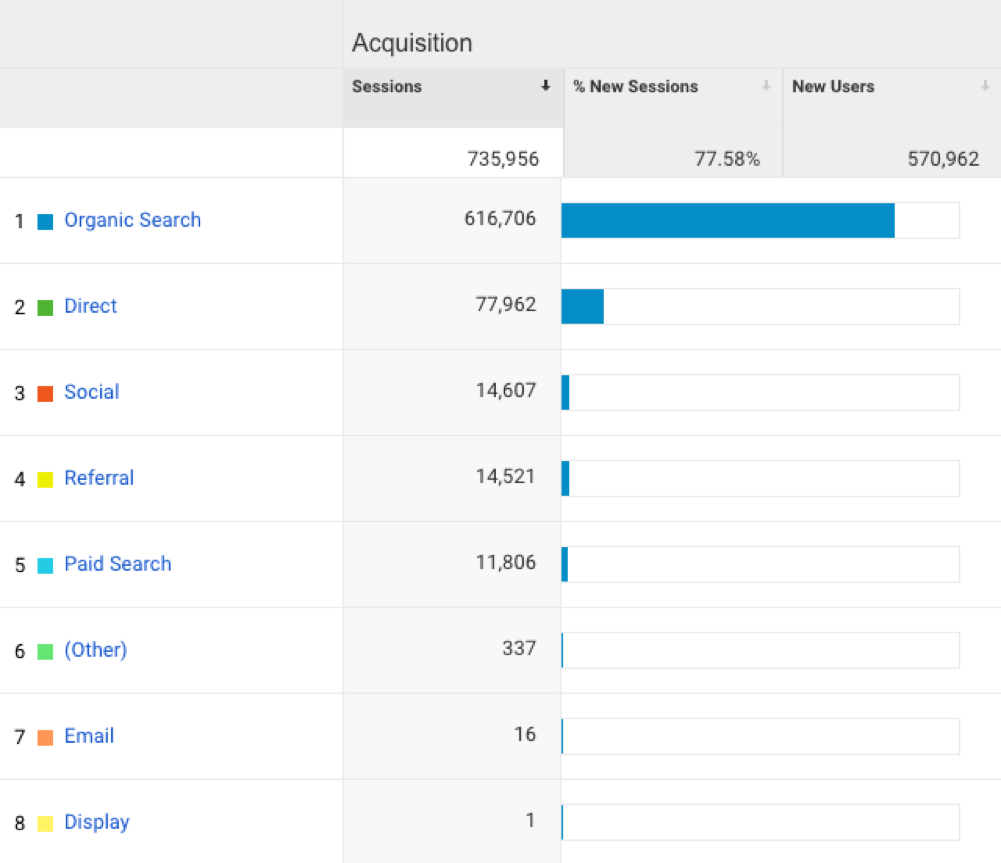
Analytics
Interpreting data trends in conversions, pageviews, and other user actions to identify opportunities and guide UX design.
There's no one magic way to create an experience that will be universally and automatically loved. That's not the goal - rather, we seek to create experiences that will intuitively work for and delight a specific target audience. Similarly, there's no one method for measuring the success of our creations. That's where analytics comes in.
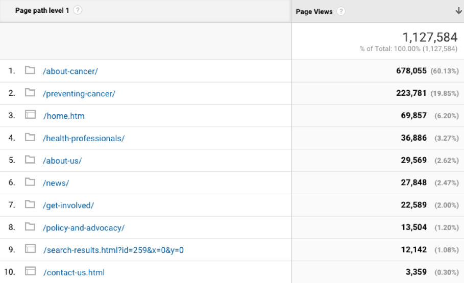
The data indicated that the “About cancer” section had the highest number of page views at 60%, followed by “Preventing cancer” at 19.9%.
Lowest scorers:
- About us – 2.6%
- News – 2.5%
- Get involved – 2%
- Policy and advocacy – 1.2%
Full Analytics Findings
Comparative Analysis
We intiated a comparative analysis exercise across the different state sites for the Cancer Council. The primary insight we gained from this was as follows:
In mapping a person's cancer journey, different stages were articulated and later used for the basis of developing personas. These 6 stages were:
- I think I have cancer
- Recently diagnosed with cancer
- In active treatment for cancer
- Living with a chronic condition for cancer
- Survivorship
- End of Life
Full Comparative Analysis
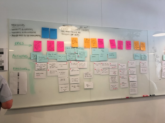
Personas
We identified 15 key user groups and narrowed them down to 3 core behavioural personas.
A persona, (also user persona, customer persona, buyer persona) in user-centered design and marketing is a fictional character created to represent a user type that might use a site, brand, or product in a similar way. Our research lead us to 3 core behavioural persona groups.
 Patients & Carers
 Health Professionals & Researchers
 Donors & Volunteers
Persona Hypothesis
The nature of the Cancer Council’s role in the community requires empathy and understanding due to the areas they focus on. Visitors can be vulnerable and want the Cancer Council to not only offers accurate information, but do so in an understanding matter.
This aligned really well with our workshop findings around what the key user groups were, and hence by cross-referencing existing Cutting Edge research to the workshop we arrived at three core behavioural personas who have priority in terms of the content architecture and importance to the business.
Full Persona Analysis
Language and Tone
The nature of the Cancer Council’s role in the community requires empathy and understanding. Users can be vulnerable and want the Cancer Council to not only offer accurate information, but do so in an understanding way. They do this with great skill at their offices and on the phone, and the website should be no different.
Therefore, by understanding the information requirements of our key user segments, we arrived at 3 primary statements to describe their emotional needs which are as follows:
- Patients & Carers
“I am affected by cancer or know somebody who is, and seek information about the illness”
- Donors & Volunteers
“I want to support the Cancer Council by donating funds or volunteering my time.”
- Health Professionals & Researchers
“I am looking for the latest information on cancer and research initiatives so I can inform others”
With this understanding in mind, it’s important that changes to language and tone reflects the needs of these primary users and speak to them in an appropriate way. It is necessary to address the audience in a manner that is:
- Humanised
- Empathetic
- Definitive
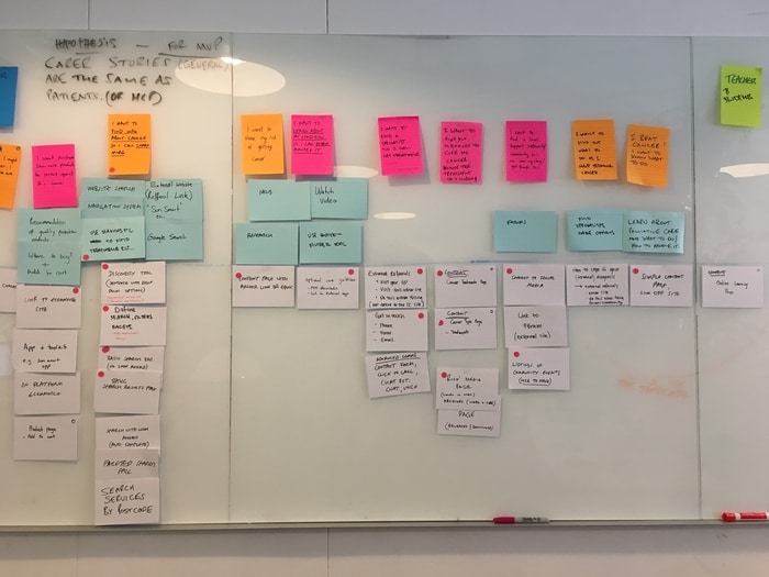
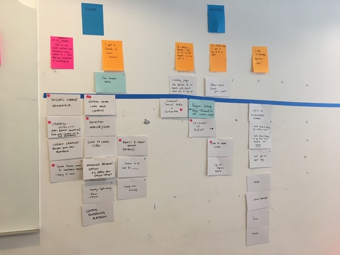
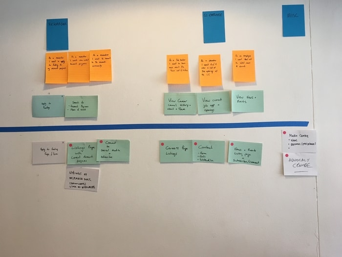
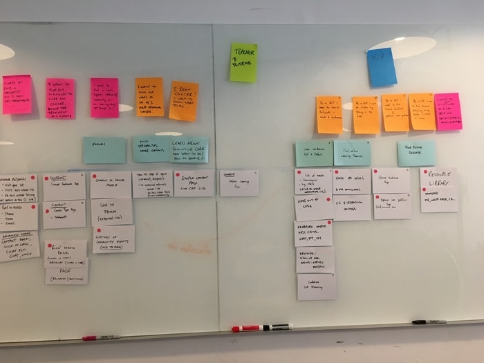
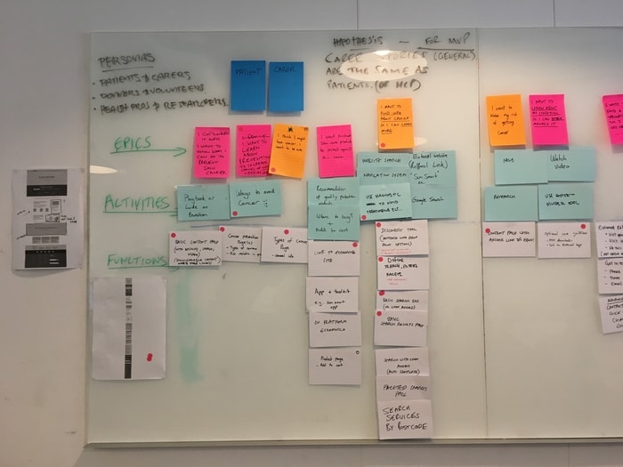
Story Mapping
Story mapping consists of ordering user stories along two independent dimensions. The "map" arranges user activities along the horizontal axis in rough order of priority (or "the order in which you would describe activities to explain the behaviour of the system").
Down the vertical axis, it represents increasing sophistication of the implementation.
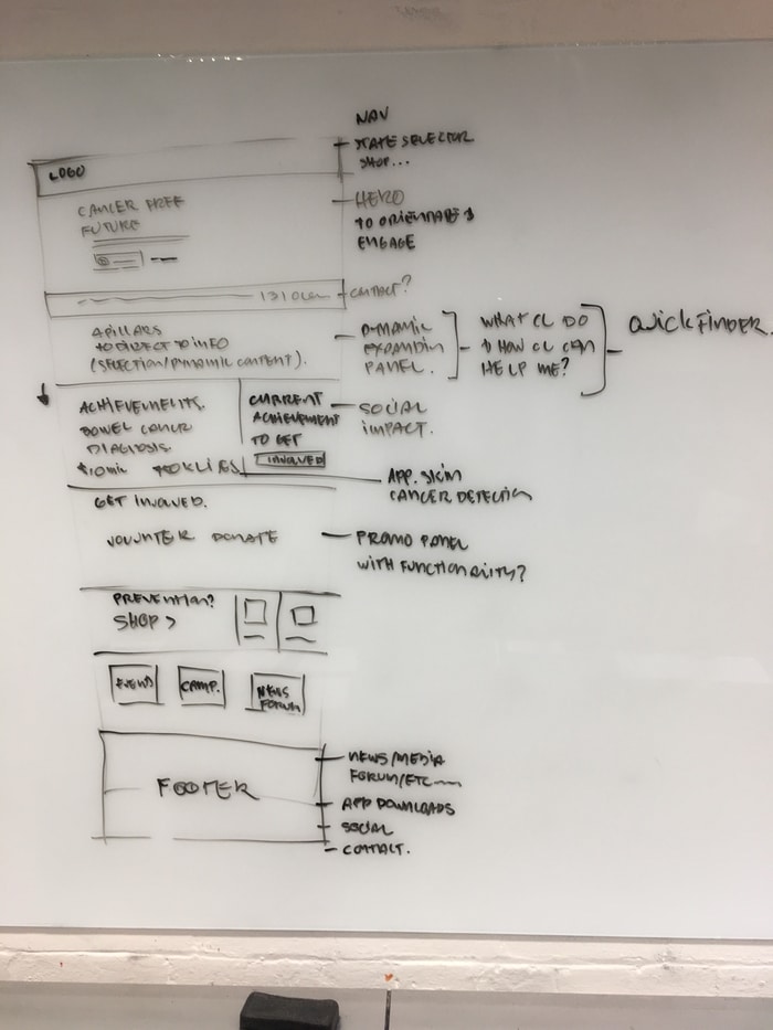
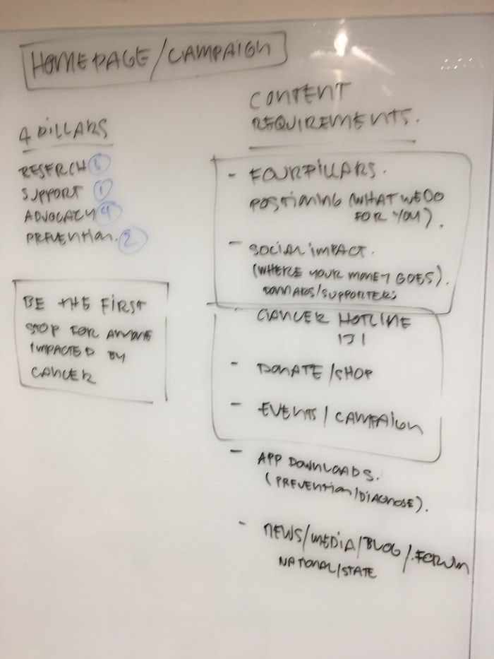
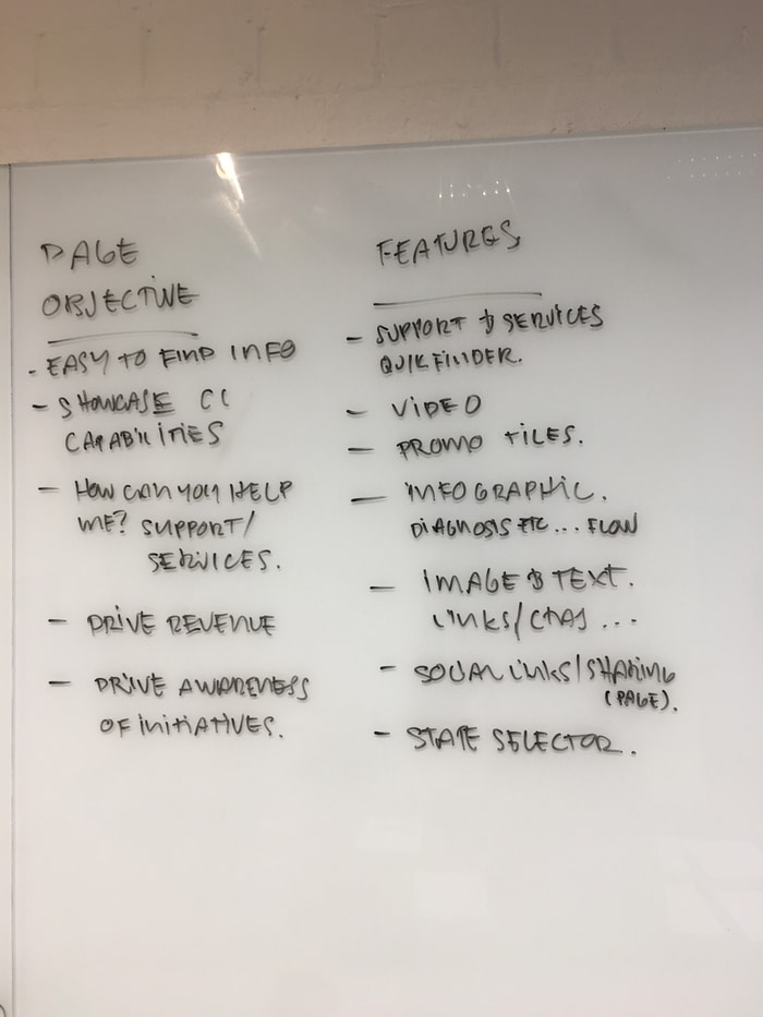
Page Objectives
Upon deciding to tackle to homepage first, we setup a workshop with the key stakeholders to gain a deeper understanding of their key goals for that page while relating them back to user needs.
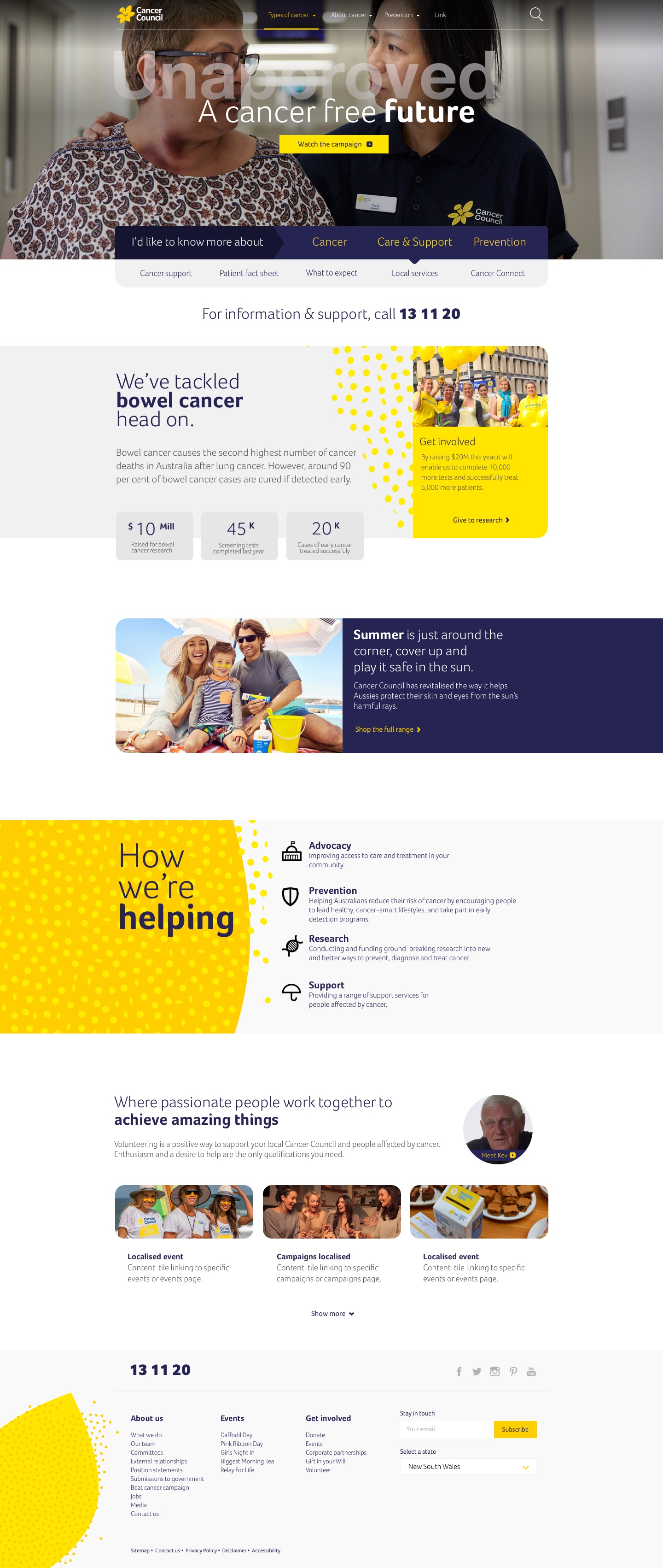
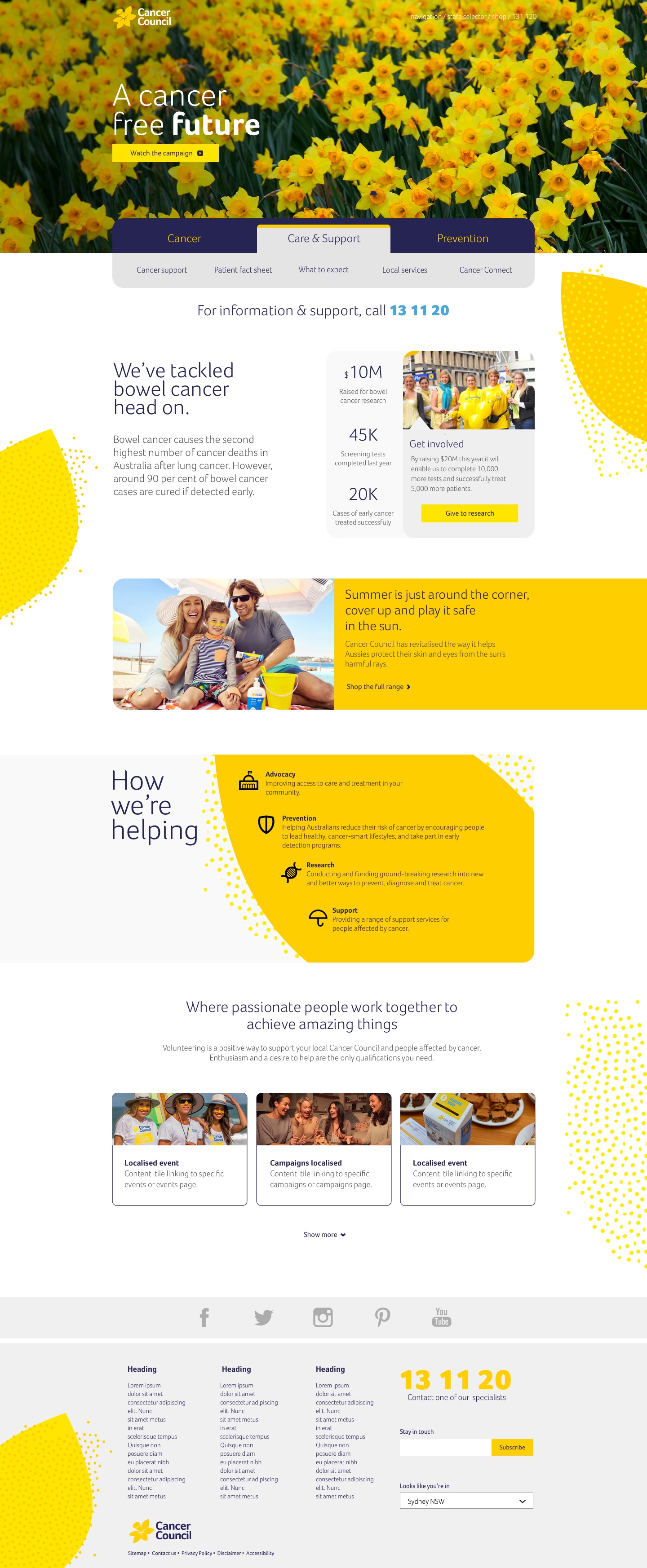
Final Mockups
After an exhaustive research and iterative design process, we finally arrived at a few final mockups to present to the client. Here are those mockups for your viewing pleasure.
Design 1
Design 2